How colour choices affect consumer behaviour and psychology.
Your subconscious mind is continuously monitoring your environment and sending signals to your brain and so, prompting a response. But did you know, the way in which we perceive things even goes down to our choice in colour? This matters for your brand.
Without recognising it, you are (perhaps) more likely to opt for a dark purple taxi firm over a bright purple one. Similarly, if the price was the same, you may gravitate towards the green petrol station over the pink. As a customer, this may sound silly and unimaginable. However, as a business, this is well thought out and intentional, designed to influence your decisions.
It is said that the use of colour can trigger a psychological response that can alter the way in which we see things. Individuals don’t always react in the same way to colours due to previous experiences, however, there are a few generalities in which people do. So, if you like having bright orange walls and someone else doesn’t, don’t take it too personally.
Colour Psychology and Branding
Colour can be used as a powerful marketing tool – it already is, all around you brands have selected colours purposefully to impact the way in which we think and behave.
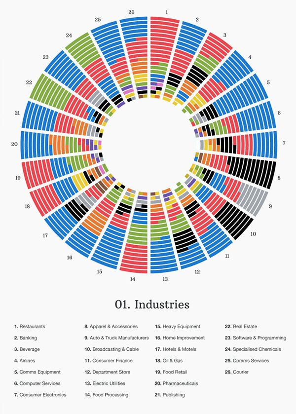
The infographic below shows the most popular colour choices by industry. This was created by Towergate Insurance by analysing over 500 logos from varying sectors. It’s interesting to take from the below that black is used most often in apparel and accessories industries to portray sophistication and power – things people are happy to put their money towards in order to be associated with. Red can be seen most commonly in restaurant branding, attracting people through bold and passionate advertisement.

With all that said, it’s no wonder branding and design can take companies years to master. Creating a logo, content and corporate identity that accurately reflects your offering is just as important to your business as anything else.
What can different colours insinuate to consumers?
Colours, shades and hues can be powerful marketing tools – if used correctly. The way in which these are used and where, will play an important role in how your brand is perceived, whether you know it or not. This emotional cue can also help with attracting and retaining your ideal customer – helping you to speak to your target audience.
Red
Used intentionally to capture (positive or negative) attention, show power and express passion. A bold colour for a bold brand and purpose. Ever wondered why warnings, promotions and call-to-actions are always in red?
Orange
Orange tones are said to be inviting by providing a sense of adventure, comfort, creativity and success. Often used to target younger audiences or for DIY/home brands to create the feeling of freedom.
Yellow
Ultimately anything yellow gives a sense of happiness and optimism and can be particularly motivating. For brands wanting to inspire and uplift – yellow will do just that.
Green
Calming and balancing. Let’s take Holland and Barrett – a health-food store ultimately wanting to present feelings of calm, trust, de-stress and wellbeing to its customers and attract those who want to feel just that.
Blue
Known for its connotations with trust, knowledge and responsibility, blue is a soothing colour whilst also inducing feelings of dependability and calm to those who notice it. As one of the most-liked colours globally, it’s no wonder 33% of top brands use it as well as in hospitals and spas.
Purple
Purple is a great colour to create a feeling of mystery and nobility. Holding the power of red whilst also the responsibility of blue allows anyone who uses it to be seen as creative, but luxurious.
Pink
A soothing and sensitive colour creating feelings of unconditional love. However, different shades and tints can portray different meanings so should be used carefully. Too much can often be associated with immaturity and even, lack of power. When used appropriately, this colour can generate feelings of hope and be playful.
Monochromatic
For those wanting to be seen as powerful, elegant and modern. The simplicity of black can create a huge sense of clarity and confidence. Often used by technology companies and designers to give customers confidence in the brand as knowledgeable and in control.
Whilst the opposite, creates feelings of trust and innovation. White is seen widely as a ‘clean’ colour, creating a brand that is pure and peaceful.
Brown
A strong colour to create feelings of structure, comfort and purity. Although not the most stimulating or eye-catching it is great for brands that do not want to be seen as bold and loud, but supportive and reliable instead.
Overall
Whilst individual colours can give your brand a sense of whatever it is you are trying to convey, it is important to remember that a mix of these colours can also help to achieve just that. For example, if you want to inject the idea that you are reliable and provide a high quality service, why not try blue and black?
In just 10 seconds, people have formed a judgement on your brand. Whilst obviously, 10 seconds is not enough to form a fair opinion, this is all you have. Colour is one of the first things noticed by a customer and so, if selected correctly can help boost your credit by 40% and is a marketing tool you cannot afford to overlook.


SUBMIT YOUR COMMENT